


Launched LISA, an AI-powered research platform enabling over 120,000 conversations across 14+ languages for 7 global clients, driving annual savings of ~€350,000.
Reimagined market research by shifting from traditional surveys to AI-driven conversational experiences, helping researchers collect richer, more authentic insights at scale.
Contributed to the end-to-end product design, leading the respondent conversation experience and data visualisation system, while collaborating closely with developers, researchers, and leadership.
Focused on building a scalable, accessible design system and creating meaningful, human-centered interactions that made data collection faster, simpler, and more engaging.
On an average, 1M+ online surveys have been distributed globally to learn about consumers and generate insights
Epiphany RBC, a research-driven consultancy, has long used surveys as a key online research tool for companies across a variety of industries, including finance, FMCG, retail, healthcare, etc.
On an average, 1M+ online surveys have been distributed globally to learn about consumers and generate insights.


Embracing change, AI and leaping towards conversational ways of learning from people
After COVID, companies began cutting research budgets to save costs. At the same time, the rise of AI sparked new possibilities in how insights could be gathered. With client projects slowing down, Epiphany chose to see this as an opportunity to adapt.
Instead of clinging to outdated surveys, the team decided to use this as an opportunity to rethink, embrace AI and shift towards conversational ways of learning from people, signaling the end of the survey era and the start of something new.


Part of an orchestrated play of vision, thoughts, ideas and feelings to build meaningful conversations
As a product designer in the team I contributed to all phases of product development. Regularly worked with CEO, developers, researchers and most importantly my fellow designer.
Within that I led the design of respondent conversation experience and visualiser.
Approach to collaboration was weekly alignment, co-creation and brainstorming sessions with super users, CEO and development.

Approach to design was not necessarily linear, adapting to each feature and stage of implementation.
On a macro level we would begin by running brainstorming sessions with stakeholders including the CEO to define high-level concepts.
From there, we built detailed user flows and high-fidelity designs, aligning with super users in weekly sessions. Each iteration helped refine the direction further.
Finally, we broke things down into smaller, sprint-sized pieces: creating components, adding tokens, testing and presenting updates in bi-weekly company-wide demos.

Understanding the process of research, how people work, what tools they are using and most importantly how do they feel
As a newbie to this domain and my role as a designer in the system the first step was to understand the process of research, how people work and what are the tools they are using and most importantly how do they feel.
To do this I began UX research as a self initiated task in the process of design which wasn’t practiced before.
I led discovery workshops to understand the journey of a research (overall process) especially focussing on translations and analysis.


We found the bottlenecks in Epiphany’s research process leading to chaotic feedback loops.
Through qualitative interviews, we we found major inefficiencies in the current process. Manual data cleaning consumed significant time, while reliance on third-party resources added cost and delays.
Fieldwork is difficult to adapt, analysis only began after completion and custom survey design took far too long.
On top of that, outdated visuals weren’t scalable increase stress among researchers and ultimately impacting the business.


Survey platforms today are efficient but uninspiring
We analyzed more than 10 platforms (B2B and B2C) to see how they streamline the research process. From setup to making sense of the results.
Most platforms have strong infrastructures: independent databases, clear workflows and dashboards to visualize data.
But what we noticed missing was just as important. Few tools supported complex custom routing. None really leaned into conversational respondent engagement. And in the end, most platforms felt the same: standard, technical, uninsipiring, surveys dressed up in different visuals, but still surveys.


The direction was to focus on making surveys easier to build, conversations more engaging and data instantly useful.
You build what you see.
Visual-first builder, manager and visualiser inspired by PowerPoint’s mental model.
Everything in one place. unified process and streamlined worflow
Humanise interactions.
Moving away from rigid forms toward conversational, engaging flows.
Scalable design system for all the input tools
You see what you get.
Democratizing research through clear, visualized data for everyone.
Reducing repititve and manual tasks of data flagging, cleaning and descriptive analysis
We sketched early workflows to bring clarity and alignment before moving into prototypes.


Creating a blueprint that connected user flows, interfaces and AI systems into one cohesive platform.
We mapped conversations like a dialogue between people, focusing on how listening, learning and responding create flow.


We started small, added layers step by step and adapted along the way.
Piece by piece, a full workflow emerged and we kept improvising as we learned.
With MVP 1, we finally had something real to build, launch and test.
A simple design system so conversations had structure
A builder where anyone could create and customise flows
A domain to launch, monitor and download data


I focussed on the interaction design of the moderator to make it feel alive and responsive.
In MVP 1, we realised the moderator wasn’t just a visual element it was the heart of the conversation. If it felt flat or mechanical, people would quickly lose interest.
This meant exploring animation that gave subtle feedback, flow that kept conversations smooth, and even sound cues that made interactions feel more fun.
The goal was simple: to keep respondents engaged, so their experience felt less like filling out a form.


Early rive prototypes 2024
Experiments and alignments


At the moment
We tested side-by-side with researchers and uncovered friction we’d never see on our own.
User testing for us wasn’t a big, formal setup. We were sitting right next to research consultants, so we could just hand them a prototype and watch them try it out.
Within minutes, they’d point out things that slowed them down. A condition that was too complex, a label that didn’t make sense, or a button that isn’t working.


What started as “testing” turned into a way of working. Build, try, fix, repeat until the tool really matched how researchers worked.
These quick feedback loops meant we could fix issues almost as fast as they appeared.
Sometimes it was as small as renaming a field, other times it reshaped how we thought about the workflow.


To validate the platform, we ran a pilot project in parallel with a real research study.
The pilot proved the concept in real research, with strong ratings and feedback.
This gave us and the stakeholders the confidence that the platform wasn’t just functional. It delivered a better research experience in practice.
Respondents rated their experience highly, with most giving it 4 or 5 stars. Beyond the numbers, open-ended feedback confirmed that people found the surveys engaging, smooth, and even enjoyable.
Same project - Old platform


Same project - New platform(MVP)


We started small to prove it worked, then scaled across markets and languages.
The pilot proved the concept in real research, with strong ratings and feedback.
This gave us and the stakeholders the confidence that the platform wasn’t just functional. It delivered a better research experience in practice.
Respondents rated their experience highly, with most giving it 4 or 5 stars. Beyond the numbers, open-ended feedback confirmed that people found the surveys engaging, smooth, and even enjoyable.
Phase 1 - One Market & Language

UK → English

Phase 2 - Multi-market & Language


UK → English
Spain → Spanish, English
Germany → German, English, Turkish


Early AI use had blind spots, asking irrelevant questions until we tuned it.
Not everything worked right away. In the pilot, the AI sometimes misunderstood context and asked repetitive or irrelevant questions. Respondents noticed and some were frustrated.
But this feedback was invaluable. It showed us exactly where the AI needed tuning and we iterated to make the prober more context-aware and relevant.
By addressing these blind spots early, we made the interaction smoother and built more trust with respondents.


Small wins on the way!

After the MVP, we scaled the system with new tools, richer conversations and better data visualisation.
Once the core workflow was in place, we shifted focus from “making it work” to “making it better.”
This meant expanding builder tools and features, improving how data was visualised, and making conversations feel more engaging and dynamic.
This phase wasn’t just about adding features. It was about turning a working MVP into a sustainable, business-ready product.
We explored multiple ways to make LISA’s conversations adaptive, engaging and human.
Rather than asking static questions, we wanted conversations to adapt to feel more like a dialogue than a form.
Voice input for balancing qualitative richness with quantitative data.
Flexible layouts + color schemes responsive to sentiment.
Micro animations + visual nudges that reassured and guided respondents.
Dynamic dialogues using AI-generated responses tailored to context.
In the conversation, LISA listen, learn and respond to guide and engage consumers at every interaction.
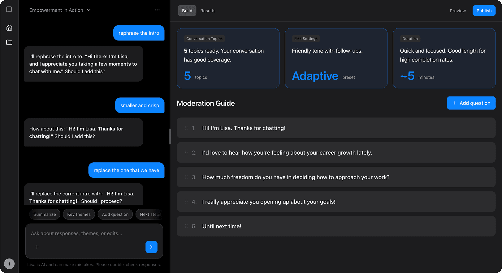
The conversation UI consisting of 3 key modular parts. Moderator & its dialogue, reply block and bottom bar.
Within fixed layouts, all the parts are modular and dependent on how settings were defined in the builder, tools selected, instruction text, images added and the moderator text etc.

Mapping the essence of an engaging conversation (verbal and non-verbal) into Lisa's behaviours.
The approach was to transform the elements of an engaging conversation into LISA's behaviours aimed make the interactions engaging by generating personalised moderator text, Changing background colours and animating the moderator.
Dynamic dialogues adds spontaneity and adapts to the conversation.
Open-ended questions are tricky: every response is different, and some come in as gibberish, speeder, or off-topic.
Instead of scripting endless prompts, we used AI to detect patterns, pick up sentiment in 70+ languages, and respond automatically.
One setup, scaled everywhere improving engagement.
Gibberish input
Interactive animations shows the non verbal behaviour and dynamic colour scheme reflects the sentiment of LISA.
Another layer of dynamic behavior came through visuals. Background colors shifted with sentiment or adapted to brand colors, while subtle animations made the moderator feel more empathetic, reacting to button presses or selections.
The idea was to keep these behaviors flexible and productized, so in the future they could either match client branding or be customized directly in the builder.
We co-created Visualiser with Researchers that gave them access to information as easily and quickly as possible.
“Visualiser is a thinking tool that help users explore patterns, organize your findings, and share them with ease”
I worked closely with consultants in weekly sessions, co-creating a Visualiser that gave them access to descriptive information as easily and quickly as possible.
I also built quick-and-dirty data visualisation prototypes using AI tools to align with stakeholders early, which helped validate what formats worked before we invested in development.
Real-time visualisation for ongoing studies.
AI-powered summarisation of open-ended responses.
Interactive filtering + visual exploration instead of static cross-tabs.
Through focussed group discussions, It was found that descriptive analysis phase takes most of the time.
Researchers only got access to data after fieldwork was completed. The files were often filled with variables that weren’t user-friendly. This not only slowed analysis but also forced consultants to rebuild variables just to make them work with third-party tools.
On top of that, detailed knowledge of the questionnaire and project was needed upfront, which made collaboration during analysis difficult

Through our weekly brainstorms with the researchers we identified key functionalities and flows needed to reach information faster.
As we moved forward, the challenge was balancing user needs without adding clutter. Quick prototypes helped us test and refine ideas.
The outcome was a simple three-part layout: variables on the left, a central viewport and settings on the right.
Key features included the ability to compare, filter and export or share visualizations directly.


The vision for visualiser resembles to the backroom used in traditional qualitative research.
The direction of layout carried froward from builder which was the step before visualizing information.
Not to make it too difficult for the user to adapt 3 section layout was the starting point of the design.
The goal was the ability to monitor the real time fieldwork and adjust questions based on the responses with the objective of the research


Rapid prototyping with AI tools helped move faster in realising high fidelity interactions.
Open ended
We built an accessible design system to scale consistently and inclusively.
As the platform expanded, consistency and accessibility became essential. I led the creation of a scalable design system that unified components into a single source of truth, ensured WCAG-compliant accessibility and introduced reusable tokens to streamline handoff.
This balanced functional needs with a flexible, clean visual language.


Value delivered
You build what you see.
Visual-first builder, manager and visualiser inspired by PowerPoint’s mental model.
Everything in one place. unified process and streamlined worflow

Humanise interactions.
Moving away from rigid forms toward conversational, engaging flows.
Scalable design system for all the input tools

You see what you get.
Democratizing research through clear, visualized data for everyone.
Reducing repititve and manual tasks of data flagging, cleaning and descriptive analysis

The entire research cycle was streamlined.
Reducing ~2 months of work into ~2-3 weeks


Impact so far.
Transforming workflows, design and engagement.
This project wasn’t just about building a tool, it reshapes how research gets done.
For researchers, it meant faster workflows, fewer manual headaches, and powerful ways to visualise data.
For respondents, it turned surveys into conversations that felt more engaging and worth completing.
For the business, it unlocked scalability, stronger data quality and new long-term client partnerships.


Research workflows
What once took 2–3 months now takes just 1–2 weeks, cutting timelines by more than half.
Business outcomes
The platform saved €350,000 annually, improved data quality translating into new clients and long-term research contracts.
Respondent experience
Average ratings improved from 4.0 to 4.6, as respondents found the conversations more engaging and enjoyable.
Design system
From scattered, one-off components to a 100+ component scalable system with tokens, reducing development handover time significantly.
This project taught me some of my most valuable lessons as a designer. I learned how products are truly built from the ground up and most importantly, how they shouldn’t be built. I realized my strength lies not only in design craft, but in thinking systemically, staying collaborative and bringing clarity to complex problems.
If I were to approach it again, I’d invest more deeply in qualitative research to define a value proposition grounded in real user behavior. I’d explore how AI could serve as a collaborator in the process, not just a tool and advocate for a culture that’s driven by data and design.
Other case studies
Epiphany RBC | 2024
~100hr saved in development time, ~20% increase in engagement, improved average rating from 4.0 to 4.6 out of 5

TwentyEighth Conversation | 2025 - Present
Built end-to-end AI SaaS platform using React, PostgreSQL, and Railway. Integrated OpenAI, Groq, Eleven Labs, and Pinecone for RAG architecture. Currently in beta with early adopters.
Say hello 👋🏽
Copy Mail:
Here and now